 wendy
wendy A few weeks ago I tweeted:
Folks with low vision: what screen size and resolution do you use? Do you use browser zoom? If yes, what %?
— Wendy Chisholm (@wendyabc) May 22, 2017
I received a bunch of great responses. Thank you. Since people were using different screen resolutions and zoom levels, we took the resolution and zoom and turned it into an effective pixel (effective pixel is defined in this article about screen sizes and break points for responsive design). We found that the effective pixels from our respondents was about 850×500 effective pixels which is really close to a typical “phablet” resolution of 960×540 or 1024×640 in effective pixels.
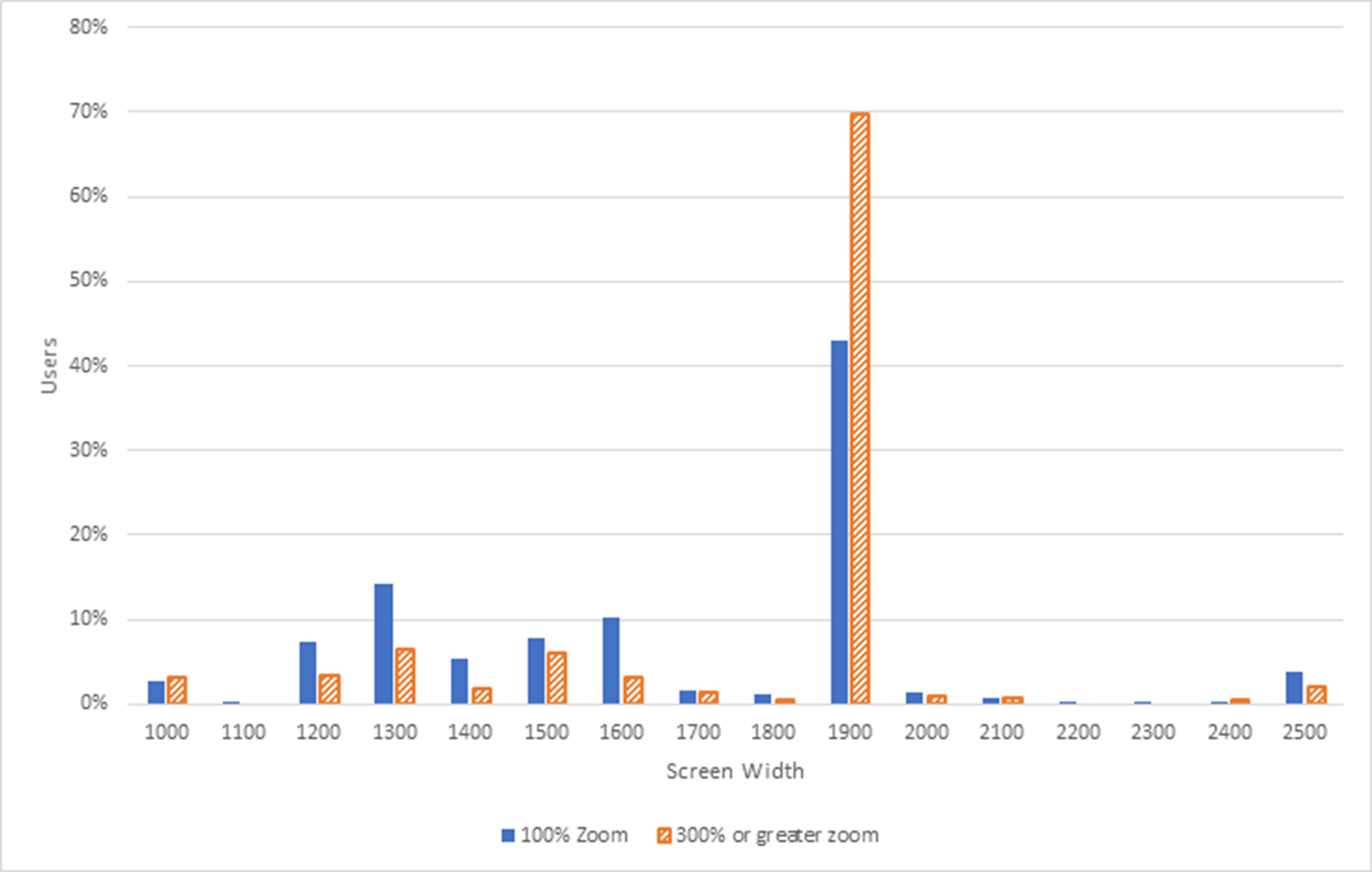
In addition, we started collecting telemetry. The following chart shows the percentage of users on the y axis and the x axis is screen width: from 1000 through 2500 increasing by 100 (for 16 data points). Each screen width has two bars one indicating 100% zoom, the other indicating 300% or greater zoom. Note that all 16 data points have at least 1% for 100% zoom. 13 of the 16 have at least 1% for 300%+ zoom. Note that the 1900 screen width has the highest percentage of users for both 100% and >300%. It’s about 70% for 300%+ and ~40% for 100% zoom.
It’s interesting data and this is just an initial insight. It’s great to have data that indicates people are using zoom at higher percentages than we anticipated.
We’re still debating what this means for us. However, it’s clear that the way we had been testing for WCAG 2.0 1.4.4 Resize Text was not sufficiently catching all of the issues our customers have been experiencing.
Hi Wendy,
I’m curious (and working on the “zoom content” SC for WCAG 2.1), if you graph the effective pixels (e.g. 1900 at 300% = 633px) whether that creates a normal distribution?
Hi, I’m Wendy’s colleague who’s been digging up this data. It’s not an especially normal distribution, I think because of the quantized nature of screen resolutions.
If you look at actual resolution there’s a very large lump at 1920 pixels, and smaller ones at ~1600 and ~1400. Looking at effective pixels the distribution is almost the same because the majority of the users aren’t using zoom.
If, however, we filter for only the hits using 200% or more zoom, we see that over 60% of users have an effective screen width of 500 to 600px. The only other lump worth speaking of is ~8% of users with a screen width of 900-1000px.
Chart: http://imgur.com/OsKXMw5
Caveat: the sample size isn’t huge, and is definitely skewed towards programmers and related professionals.
Thank you for taking the initial step on this. I would like to be included in the results — I wasn’t aware that a survey was going on or I would have gladly responded. I use 800×600 resolution as do a number of other people I know.
Under MS Windows there is another factor to consider. A user may be using 1900 resolution but they may have a Windows scale factor of 150% or 200% etc. that will at the platform level increase the size of the text on-screen including in the browser. The platform scale factor also needs to be taken into account of platforms that have such an option. This is a common option with people that have low vision although I don’t use it myself because the lines are thinner even if the text is larger — for me low resolution works better.
How much zoom a person may use may be site dependent as well depending on the font used on the site. For example, with a default font I may not use zoom with my resolution but with a site that has an 10px font I may have to use zoom to increase the size of the content.
Also another factor is that some people may use a high resolution but make the window width smaller in the browser. A smaller width may trigger a responsive site. So browser viewport width may also be a factor that needs to be accounted for.
We really need data in this area so this is a good start. This might be a good collaboration with the WebAIM low vision user survey.
Thanks David, really interesting.
I’d love to do some analytics on a high-traffic website that automatically gathers per-user data for:
– Screen resolution
– Browser window size (width & height)
– Effective browser window width (including zoom level)
– font-size change
We could then filter by changes in zoom level and see what the extremes are. I think it would need to be a JavaScript thing that logs the results somewhere, regular analytics don’t capture that.
Jonathan: great idea to collaborate with WebAIM to get data from a survey. Yes, we saw resolution and scale combinations and that’s part of why we were comparing the data using “effective pixels.” We heard from many folks that used both system and browser zoom in combination. We filtered out mobile-related usage info (in our telemetry).
Alastair: I also really like the idea of getting more telemetry from a high-traffic web site. VSTS–where this telemetry data is from–gets a lot of use but is only one data point–it would be great to get more data from some different types of sites. We’ll see if we can hook up telemetry on any Microsoft sites. Perhaps we can also get Facebook and others to collect (or share) zoom-related telemetry, too.
Zoom is mainly a temporary feature or a handicap feature, if you are wanting to make a permanent screen size change use the resolution feature. There are issues with the zoom feature that can make it hard to navigate around the screen and connect to other equipment like projectors.
Many of the windows machines being shipped recently have high resolution but they have a default recommended settings of 150% zoom on the screen. This is causing the font sizes to look larger on such machines even though the font size would be the same for all devices. Is there any way we can stop the browser from font zooming? The components are responsive and fall into one of the breakpoints, just the text zoom is something that I would like to control. Thanks !